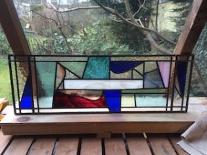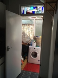
The purpose of this project was to replace a panel made from horrible cheap clear glass, which had been splashed on with white paint by someone who had no idea how to paint. It beggars belief that a workman would do such a thing.
Anyway, the client wanted to design the panel himself. Great. Here’s how it went.
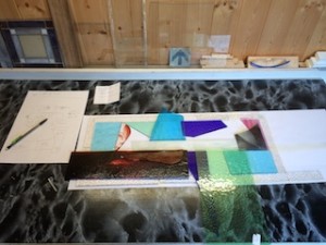
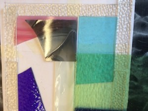
| I had a mountain of off-cuts, so we piled into them together and pulled out any piece that took our fancy. We shuffled them together, overlapping and all at odd angles. It was fun.
We decided to have a narrow border, and also liked the idea of spilling into and across the border whenever we had a nice piece of glass we wanted to bring to the fore.
Design anarchy! |
|
 |
|
| Texture, colour and angles. We had many pieces of great glass to play with. |
|
 |
|
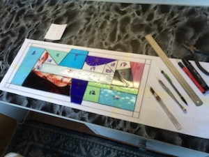
| Eventually the design settled down and I had to make some sense of it. Even though we can be free-spirited with our juxtapositioning of the glass during the exploration phase, I still had to come up with a very accurate cartoon.
I allowed the angles and curves to remain intact. So, the design wouldn’t become formal. I didn’t want to impose my own tendency to make everything symmetrical, for example. |
|
 |
|
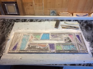
| Jump ahead to having put the piece together and here we see one of the final stages where I use talcum powder to dry up the cement. Just the cleaning up stage left to do. |
|
 |
|
| Wow! It looks great. Your eye dances over it looking for symmetry or a recognisable form, and there isn’t one. |
|
 |
|
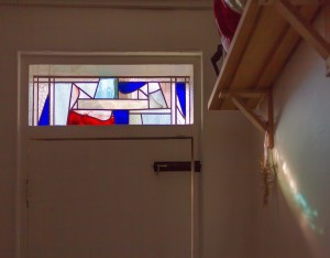
| Here it is in situ. Lots of light behind it, making the textured glass sparkle and the colours reflect onto the kitchen walls. |
|
 |
|
| This was a really satisfying project because the client became very involved, the panel it was replacing was awful and the result is fantastic.
AND, because we used almost entirely off-cuts from previous projects it turned out to cost next to nothing to make. |
|
 |

